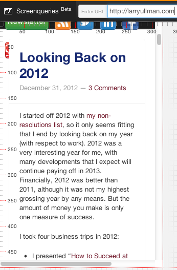
Screenqueri.es is a relatively new site, currently in beta, for testing how a Web site will look on various mobile devices. It’s an absolute snap to use: just enter the URL of your (or any) site, and Screenqueri.es will load a preview of that site, on a grid of pixels, as it would be loaded by a mobile device. Here’s how part of my site looks on an iPhone:
Once you’ve loaded the page, you can use the menus at the top to change the device or to rotate the device (virtually). The options include both phones and tablets:
I haven’t personally verified the results on all the devices, in part because I don’t have all the devices, which is pretty much the point of using a site like Screenqueri.es. When you get the chance, see how your site looks.


